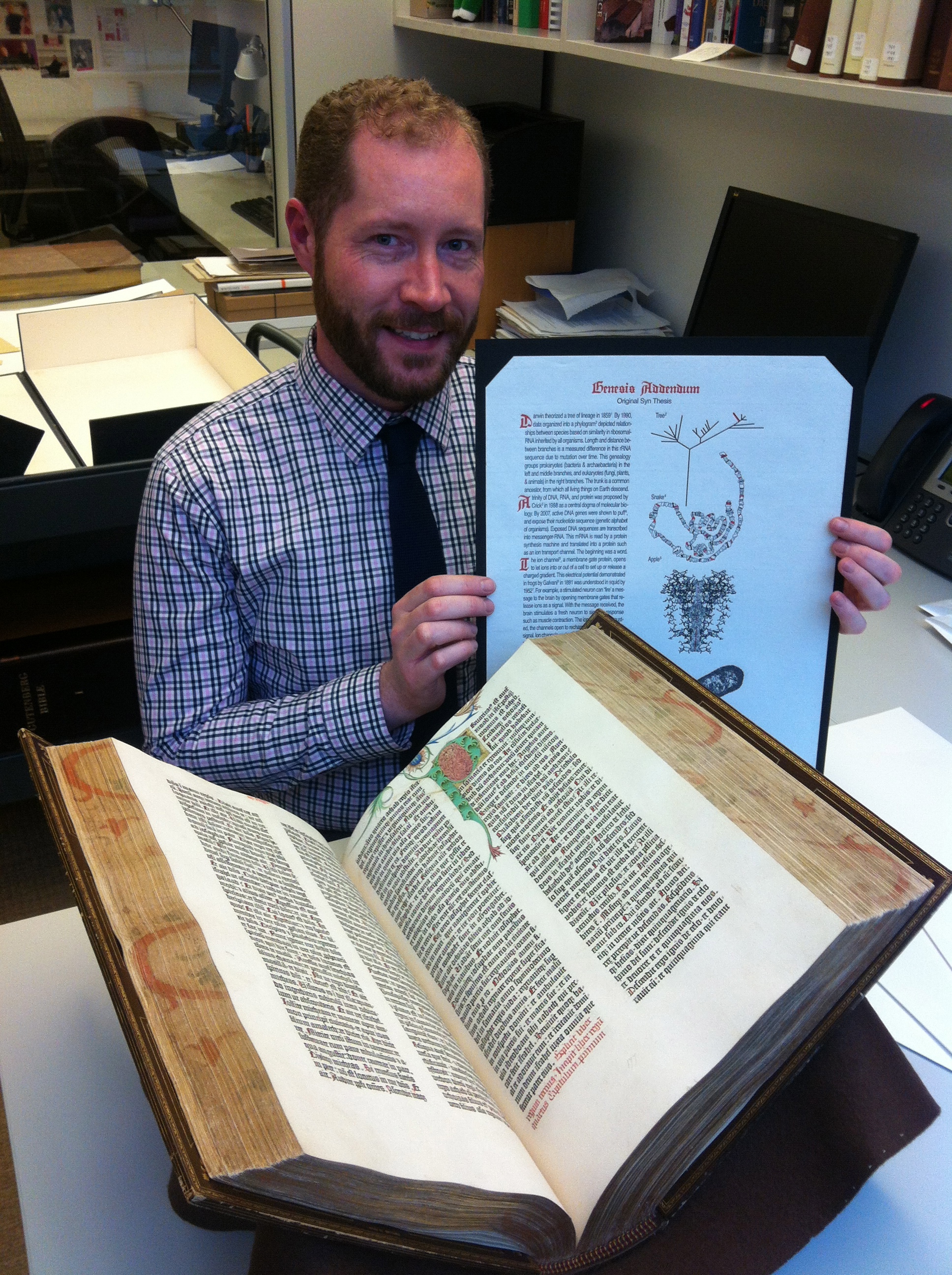
On February 9, 2016, I visited John McQuillen of Printed Books and Bindings at the Morgan Library. 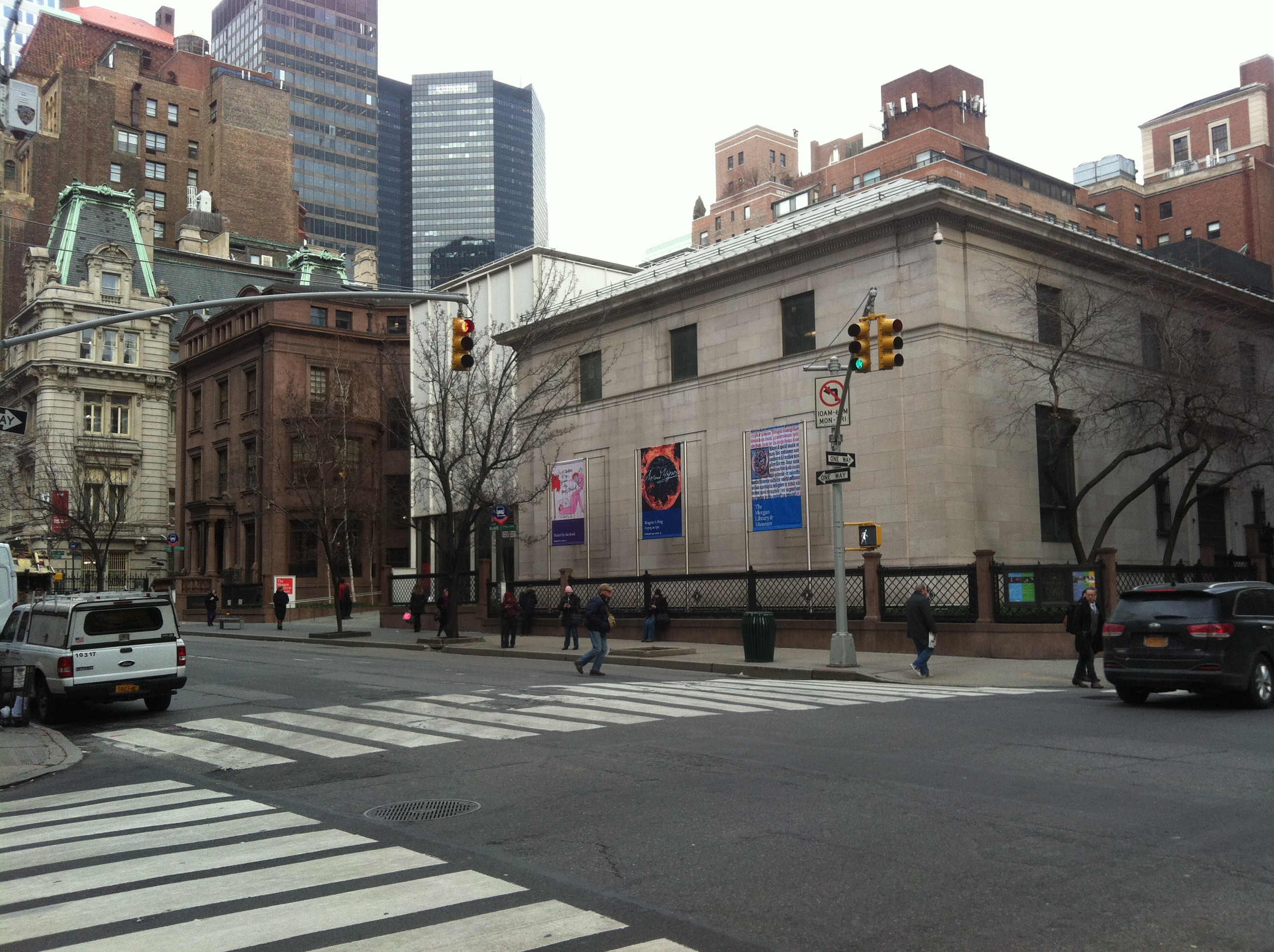
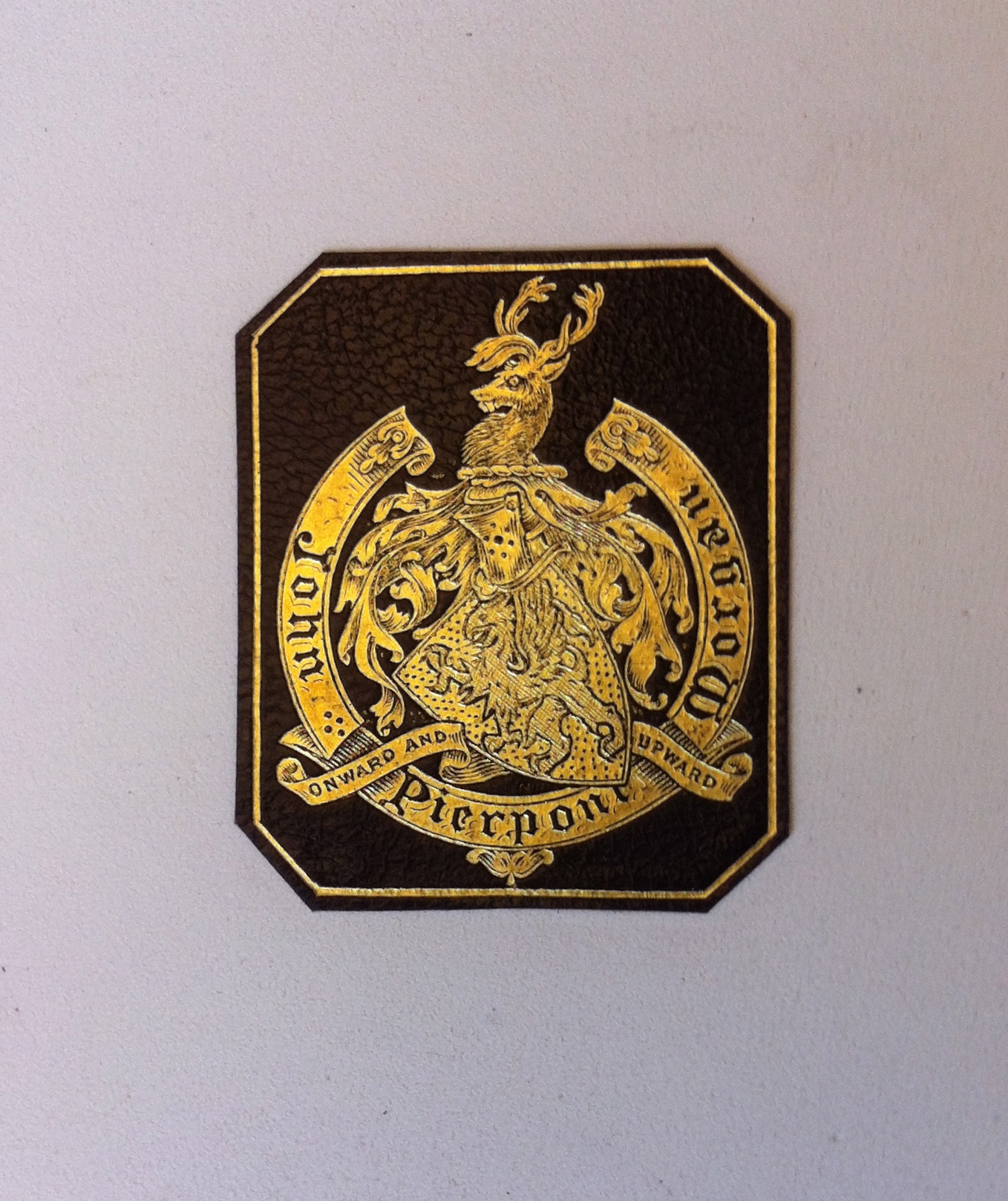
When I left NYPL, Kyle told me to tell the Morgan that Lenox brought the first Gutenberg to the New World. Upon receiving the news, John shrugged his shoulders and said simply: we have three. Below is the ex-libris or bookplate on one of Pierpont’s Gutenberg Bibles. Onward and Upward, indeed.
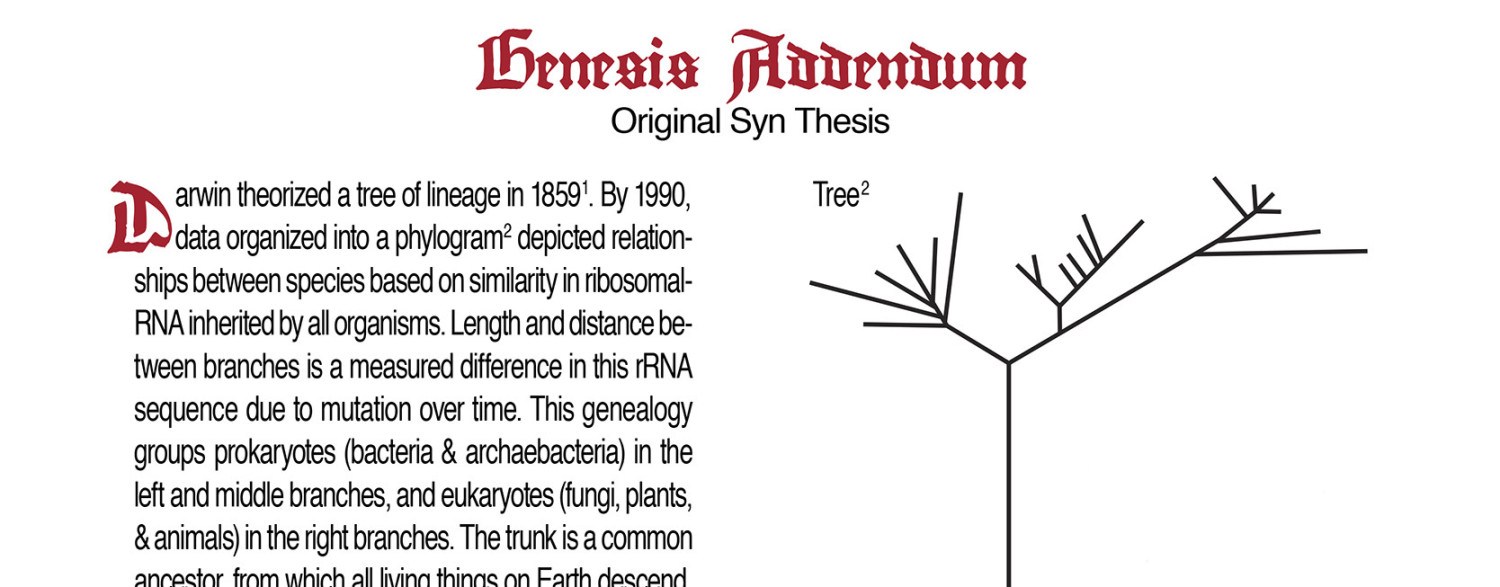
As the Morgan owns three Gutenberg Bibles, I was there to gift edition 37, 38, & 39 of my Addendum. When I asked which John would like to look at, he said, well, we’re on 37th St, so let’s look at Edition 37. Between the Morgan and the NYPL, NYC has the most Gutenberg Bibles of any city (and they are within 5 blocks of each other).
Above is a paper copy (Hubay #44). Below is the vellum copy (Hubay #37).

The vellum copy has been repaired. See how the style of ornamentation above is different than on the page below. Also notice the difference between the A and Q Initials of the page below. It is thought that a well known facsimile maker from France, Adam Pilinski, detailed the revised ornamentation. Regardless of who decorates and when, it’s a ton of work: “A complete Gutenberg Bible contains 3,945 rubrics as well as 72 six-line initials, 3 five-line initials, 61 four-line initials, 11 three-line initials, 1,292 two-line initials, and 2,509 one-line initials.”
John was really interested in the artists that decorated books in general. While most historians have studied the different printing shops, his focus is on the artists that illustrated/decorated after the text block was printed! To note, the Morgan’s early printed books have a cataloging structure of date and printing shop. So a Morgan B42 has the call number “chl-Gutenberg” (chl refers to ‘incunabula’ indicating the date of books printed before 1500). Since book decoration is generally commissioned by the buyer (and independent of the print shop), this catalog system referencing the print shop is irrelevant to John; connecting books by illuminators becomes a treasure hunt of their shelves.
The image below shows the last row of letters cut off during repair of their vellum copy. You can see the outline of the text has been penciled back in. It is unclear whether this was forgotten to be filled in with ink, or a choice to explicitly indicate that the book had been repaired. 
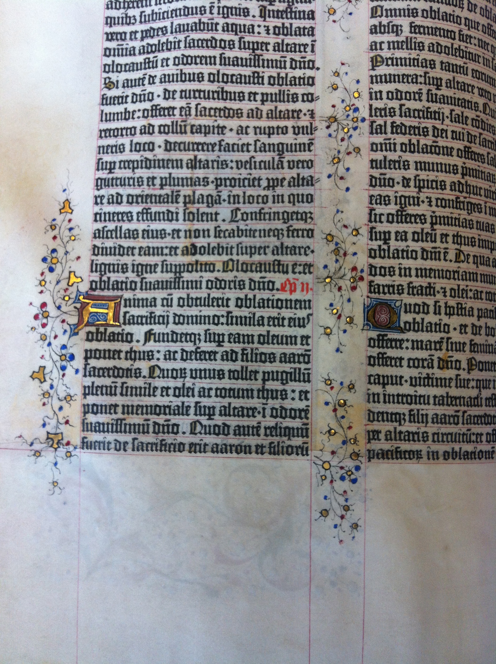
Someone had previously told me Gutenberg had 17 differently sized e’s (and other letters) in order to facilitate his perfect left and right justification. I’ve seen many of these books (relatively speaking) by now, but I’m still stunned by the experience that it’s taken me this long to actually FOCUS on the text to see for myself – these alleged variations in e’s.
If you look at the beginning of the 3rd full line of text above, it starts with “re elt.” You will notice the first e lacks a serif at its top left and bottom left, while the second e has a serif at the top and bottom left.
My Addendum used a free online ‘copy‘ of Gutenberg’s blackletter. Had I known then, I would have insisted on three different e’s for the Genesis of my title!
These details in prints are like a signature. Just as Gutenberg’s black ink is a signature (never having faded over 500 years) while forgery ink often fades. John told me about a recent scholar at the Morgan, Nick Wilding. Wilding tries to understand the art and science of early printing to determine if something is an original or a forgery. You’ll see, how the p & i or the i & p sidle up, matters in the fun detective story of the Galileo’s Sidereus Nuncius. Turns out, the forgery is likely a polymer plate copy!
My favorite view of the vellum copy, was the edge:
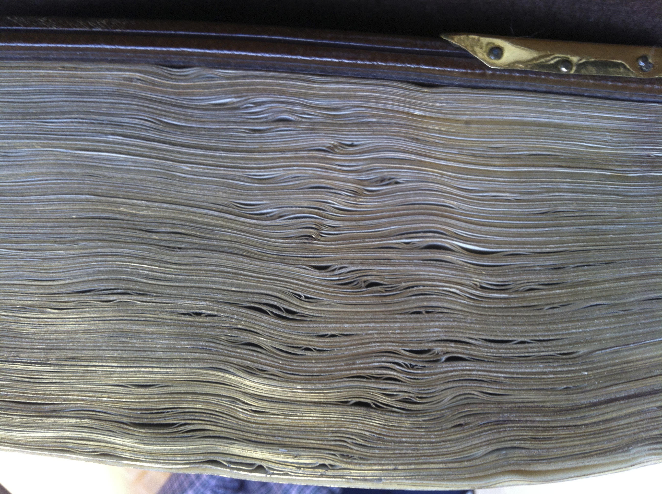
It is stunning to think how many animal skins made up this view. “Bringing into the fold” originally meant collecting a flock of sheep. In this case, that meaning is all bound up!
While their third copy was on display in the museum (Hubay #38), John also showed me their second copy (Hubay #44). Full stop. These books, printed in Mainz, Germany, over 500 years ago, have traveled all over the world. How all three resisted becoming a pile of dust, is an extraordinary feat of human stewardship and power. The first survey of remaining Gutenberg Bibles was done by Ilona Hubay (hence the Hubay number system). It appears the Hubay history of ownership of at least one of Morgan’s B42s is incorrect. Hubay had identified this vellum copy (#37, yellow capital letters and decorated in the Belgium style) as coming from Halberstadt, Germany. The revised provenance indicates it moved between the hands of a Parisian dealer, an English Earl, via Spain, via the Spanish control of the Netherlands. Apparently, Eric White of Princeton has been re-assessing the provenance of each Bible (can’t wait to meet you Eric when I deliver to the Scheide Library!) and we will have an update soon.
This second bible was discovered in a damp church and written up in a German newspaper. The decoration style is that of the Fust Master. You will see the insect holes. Morgan apparently purchased it from Theodore Irwin, an agribusiness millionaire of Oswego, NY. 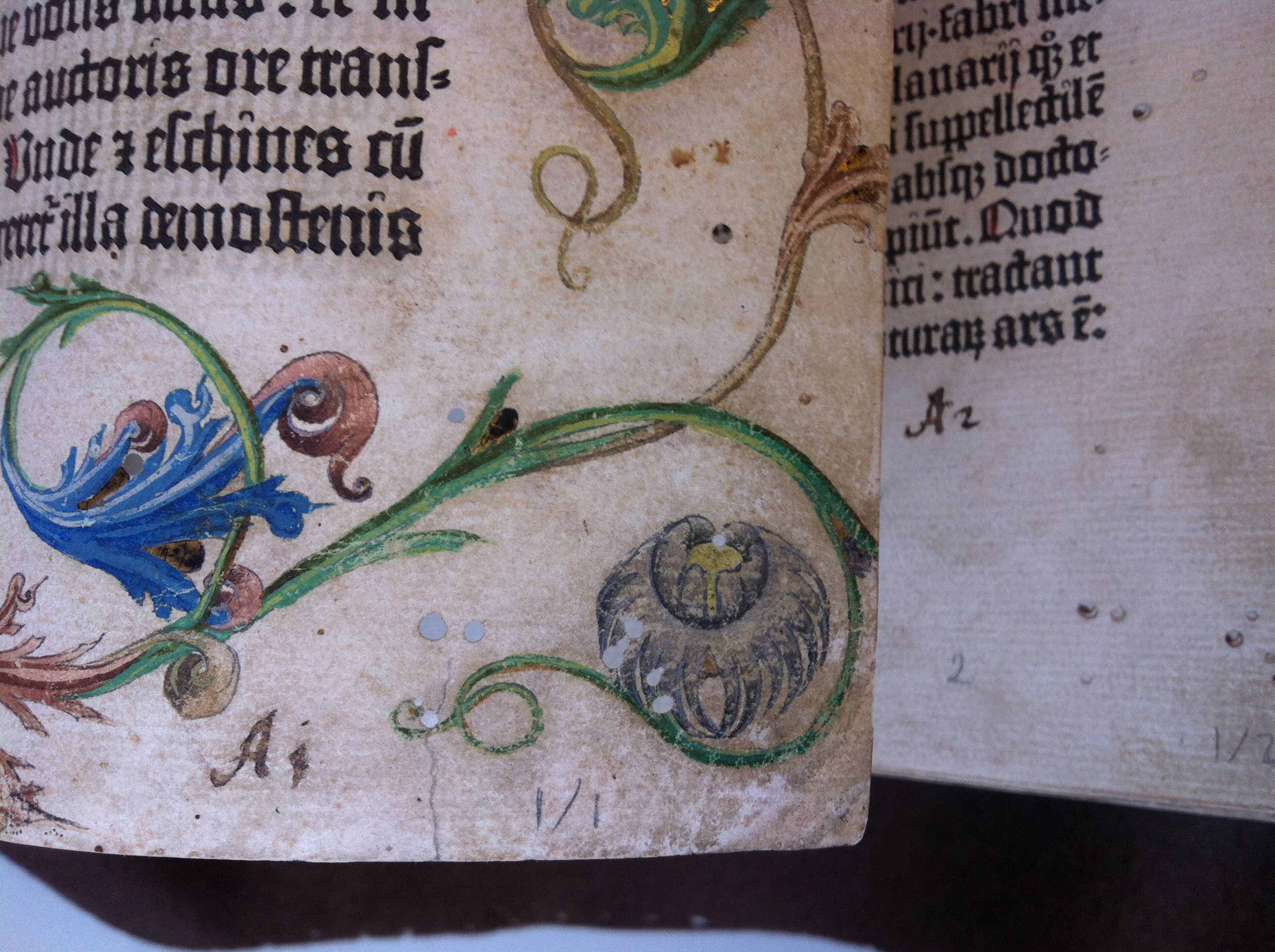
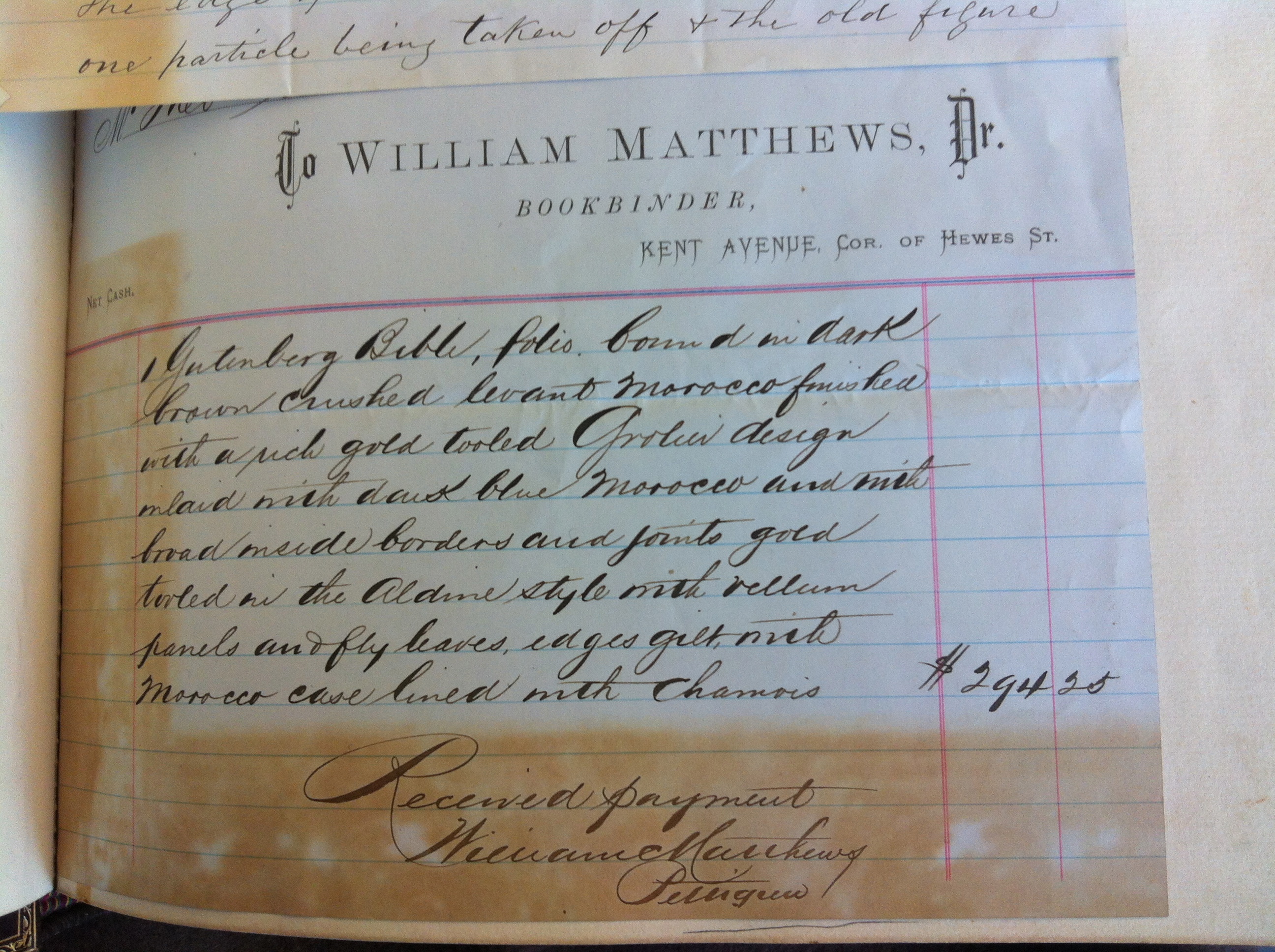
Morgan hired William Matthews, a Brooklyn binder (corner of Kent and Hewes) to refurbish this copy. Matthews washed, beat, and pressed it – changing the character of the paper significantly. It is somewhat of an overwrought binding (in my opinion), but it indicates an ‘idea’ of the book ‘object’ – which I think is meaningful in a 500 year arc of stewardship. I love the information in the image below. The blue mirror-image-A initial on the top right indicates the page was turned before the ink of the A on the opposite page had dried (patience is a struggle all through the ages!). 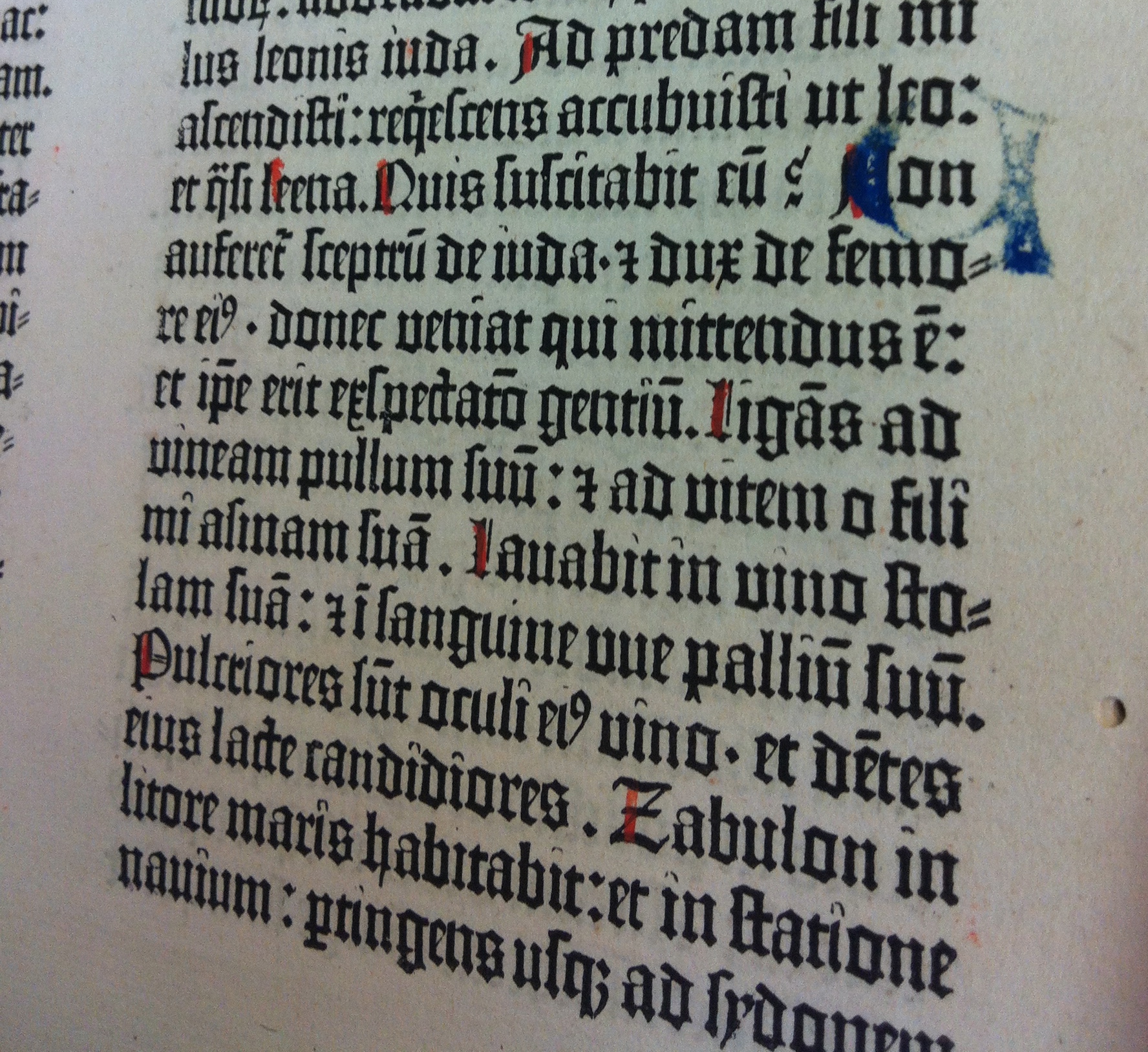
Here is the washed text block in its new binding.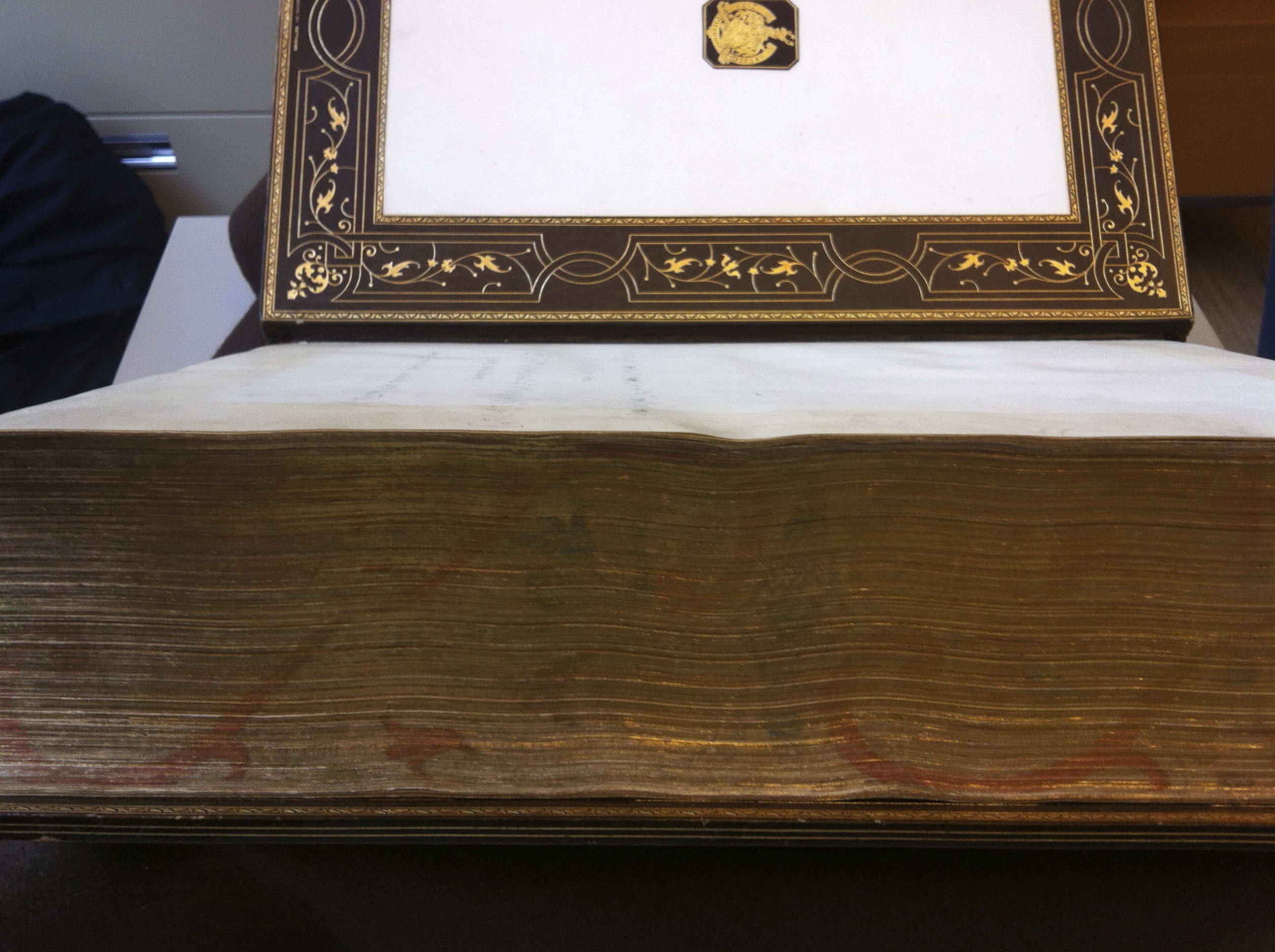
To note, William Matthews wrote “Trusting the binding will give you satisfaction.” All this, cost $294.25.
To compare ornamentation styles, the following 2 photos are of the first page of Gutenberg’s Genesis text block from 2 different editions. First image is from the vellum (Hubay #37) and the second image from the paper copy (Hubay #44).
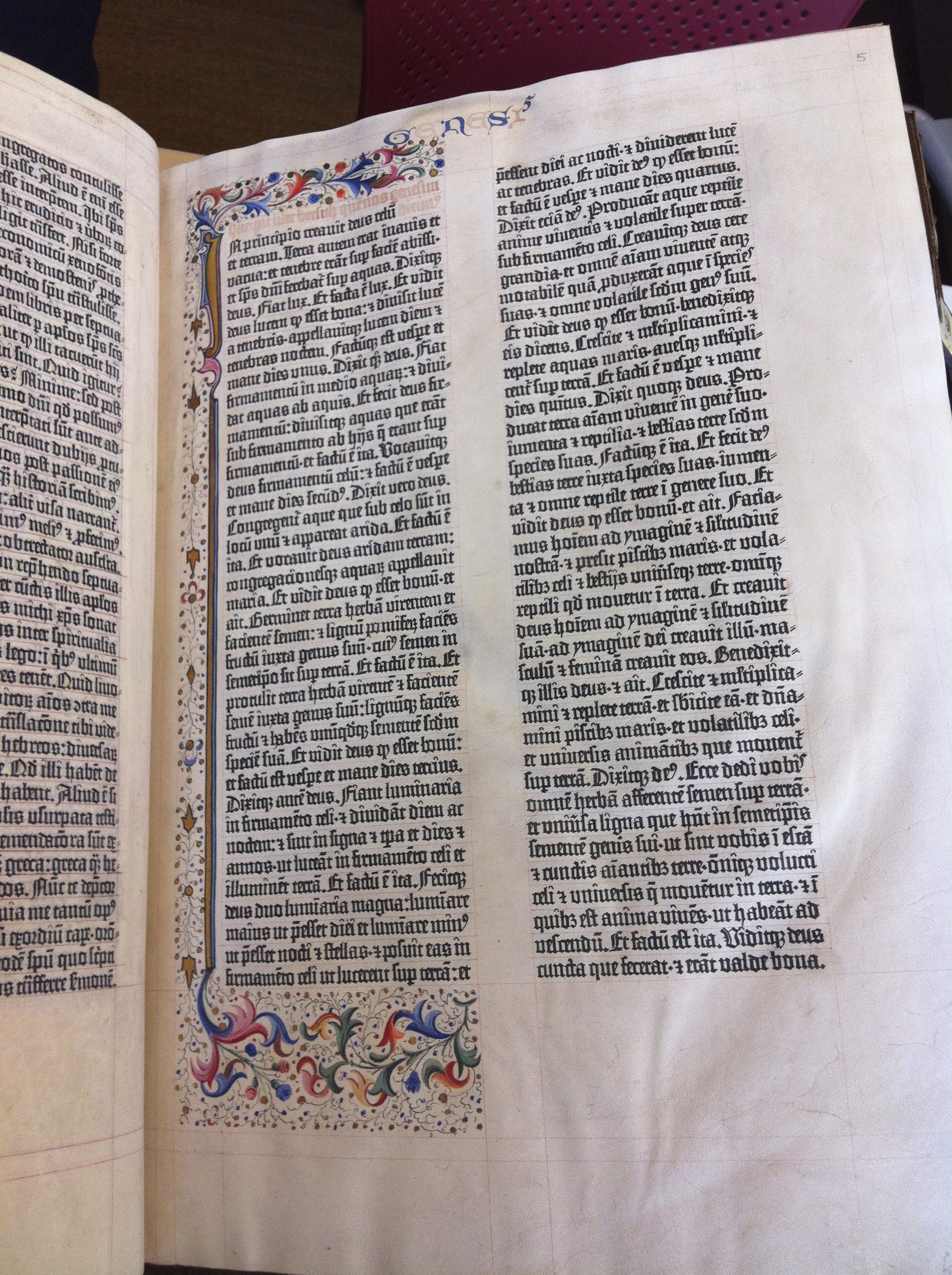
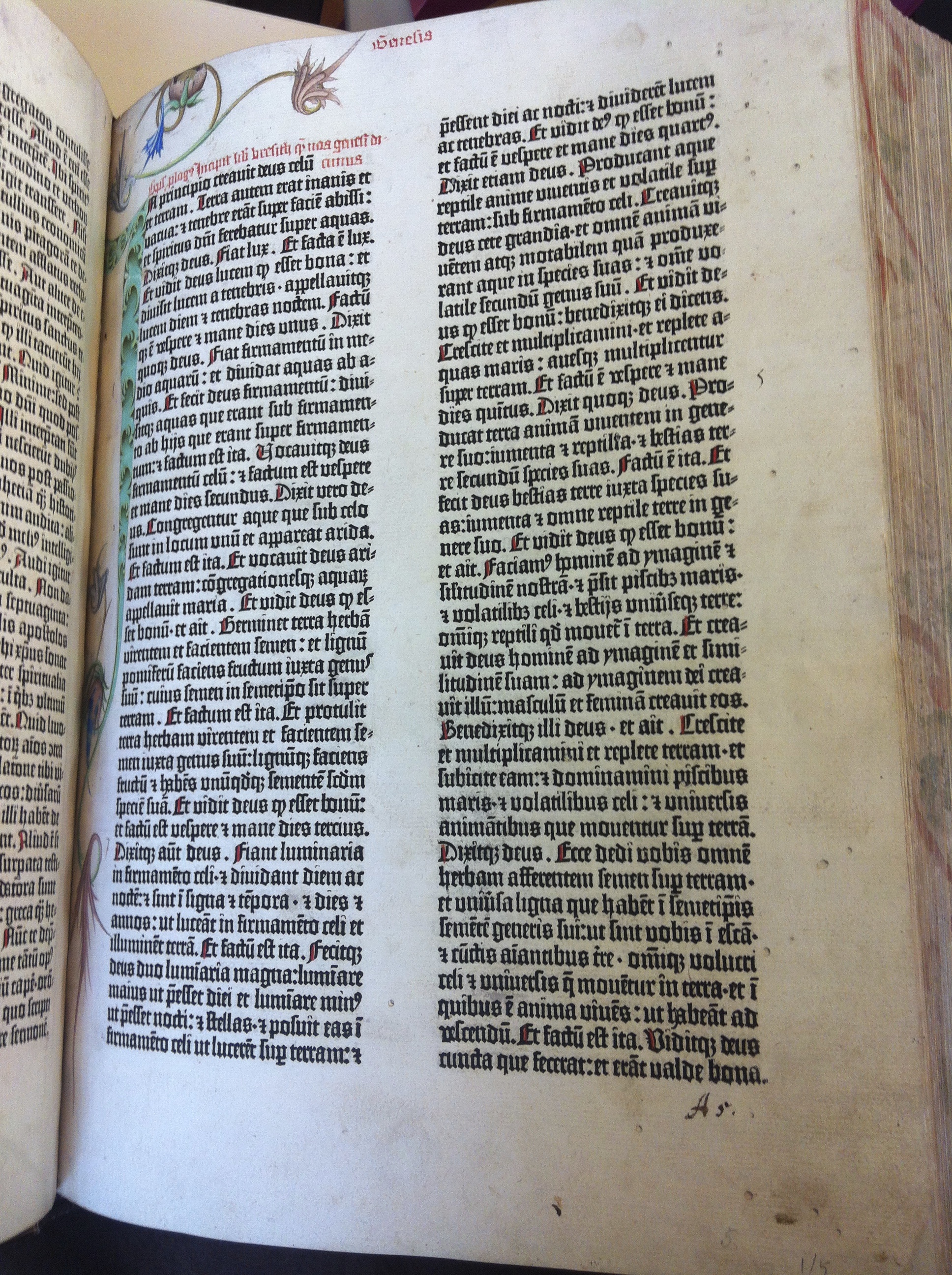
(I hope you are beginning to understand how incredible it is that I could photograph 2 different editions of the first page of Gutenberg’s Genesis side-by-side)
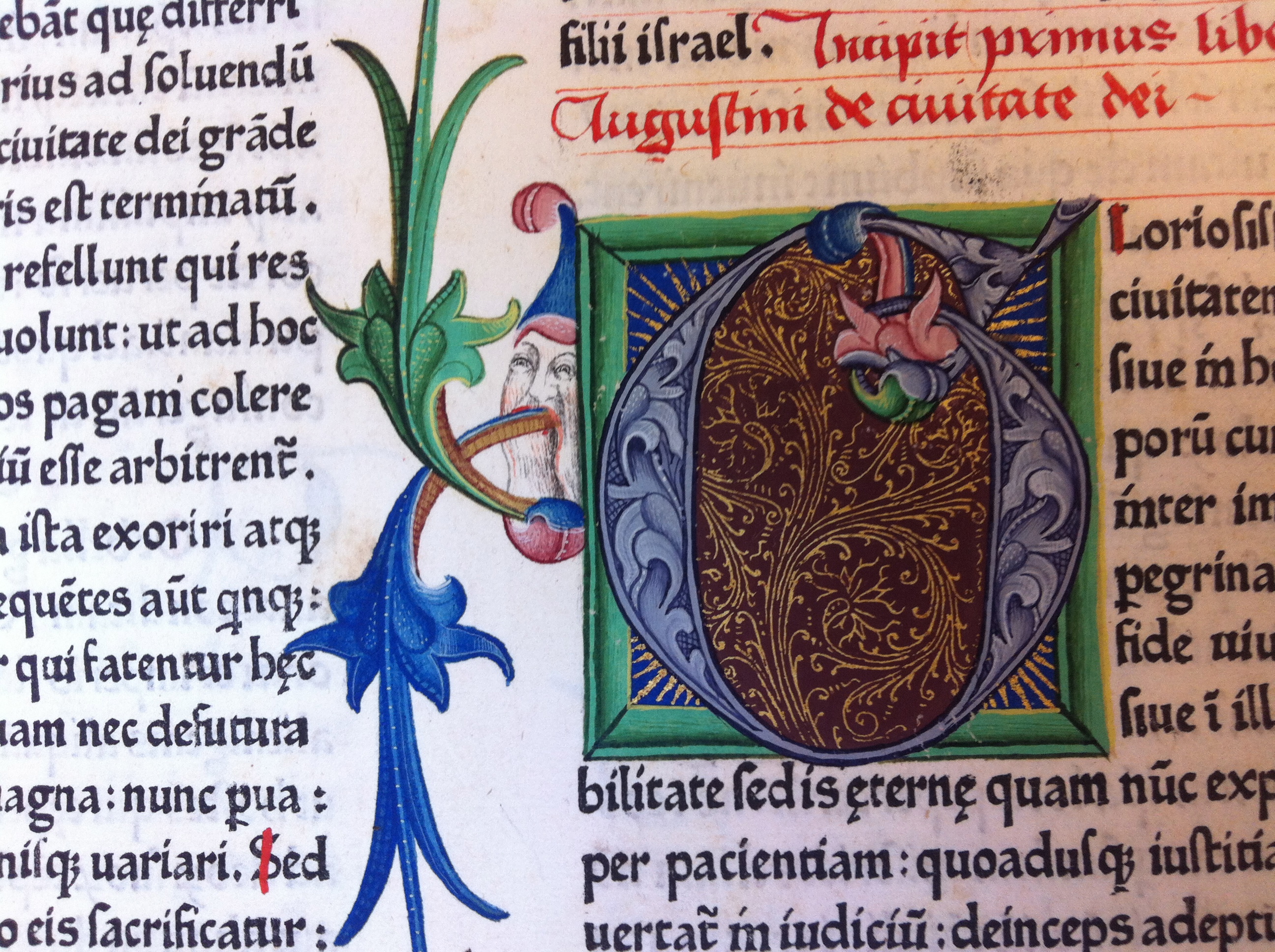
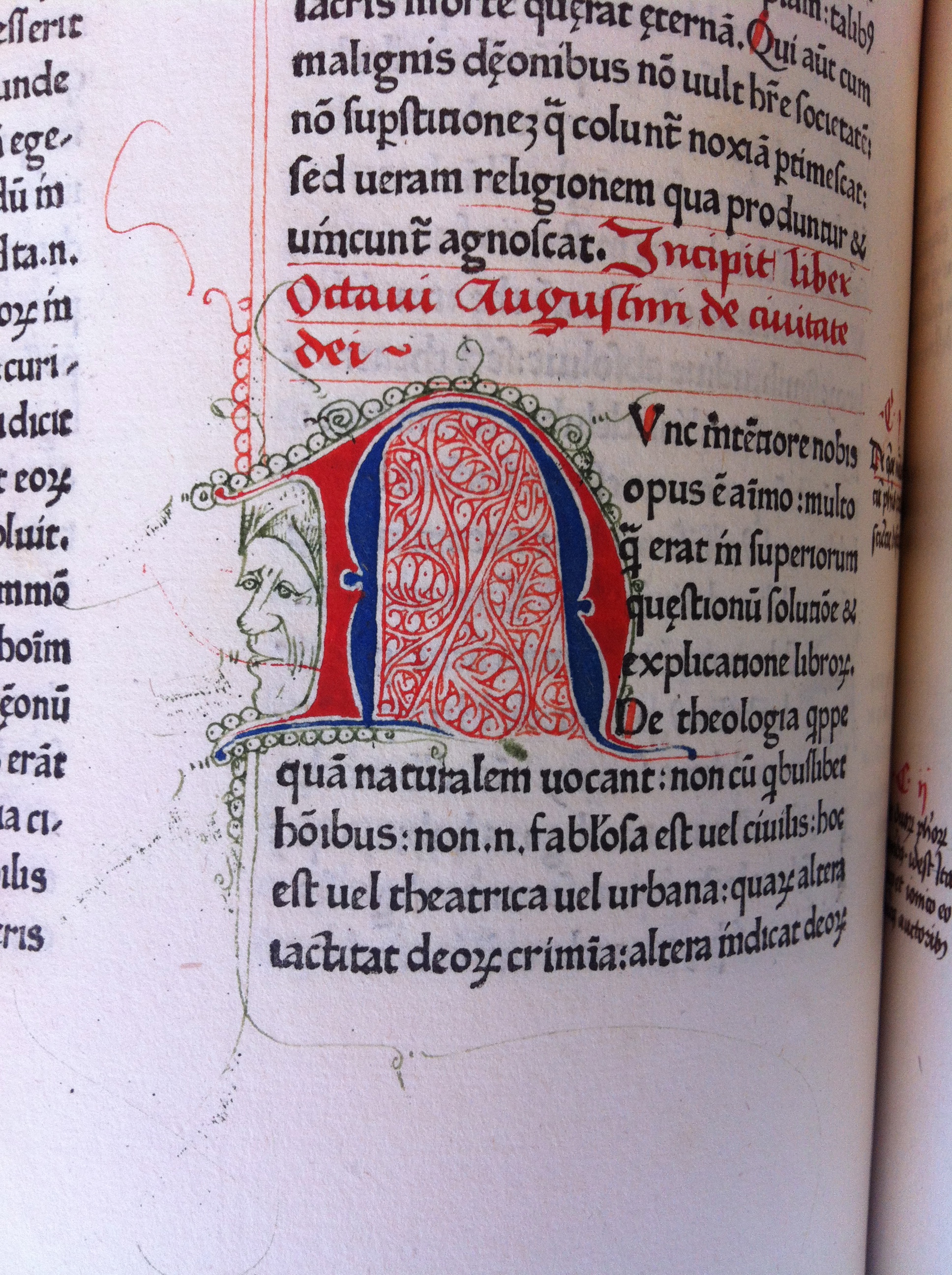
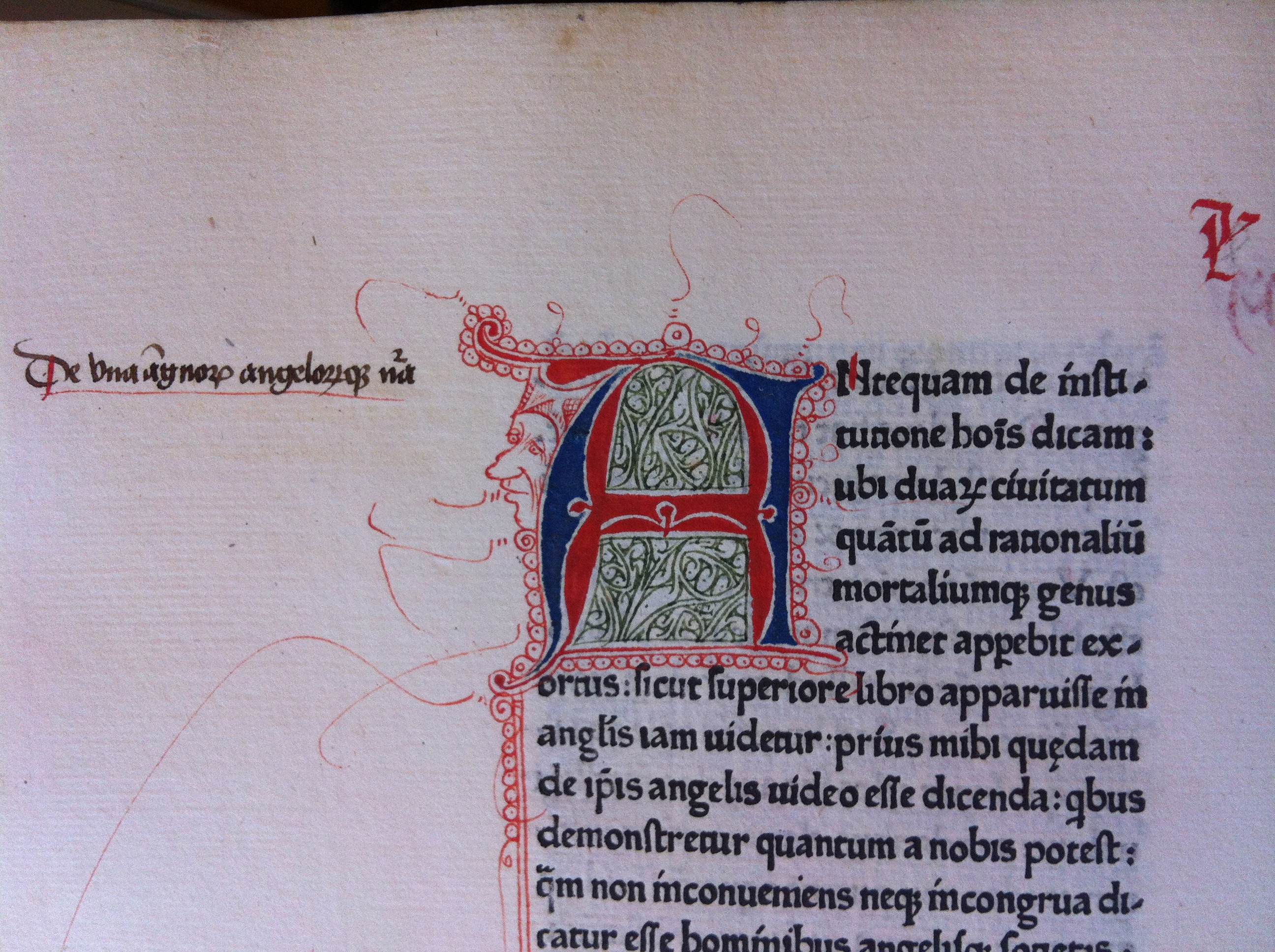
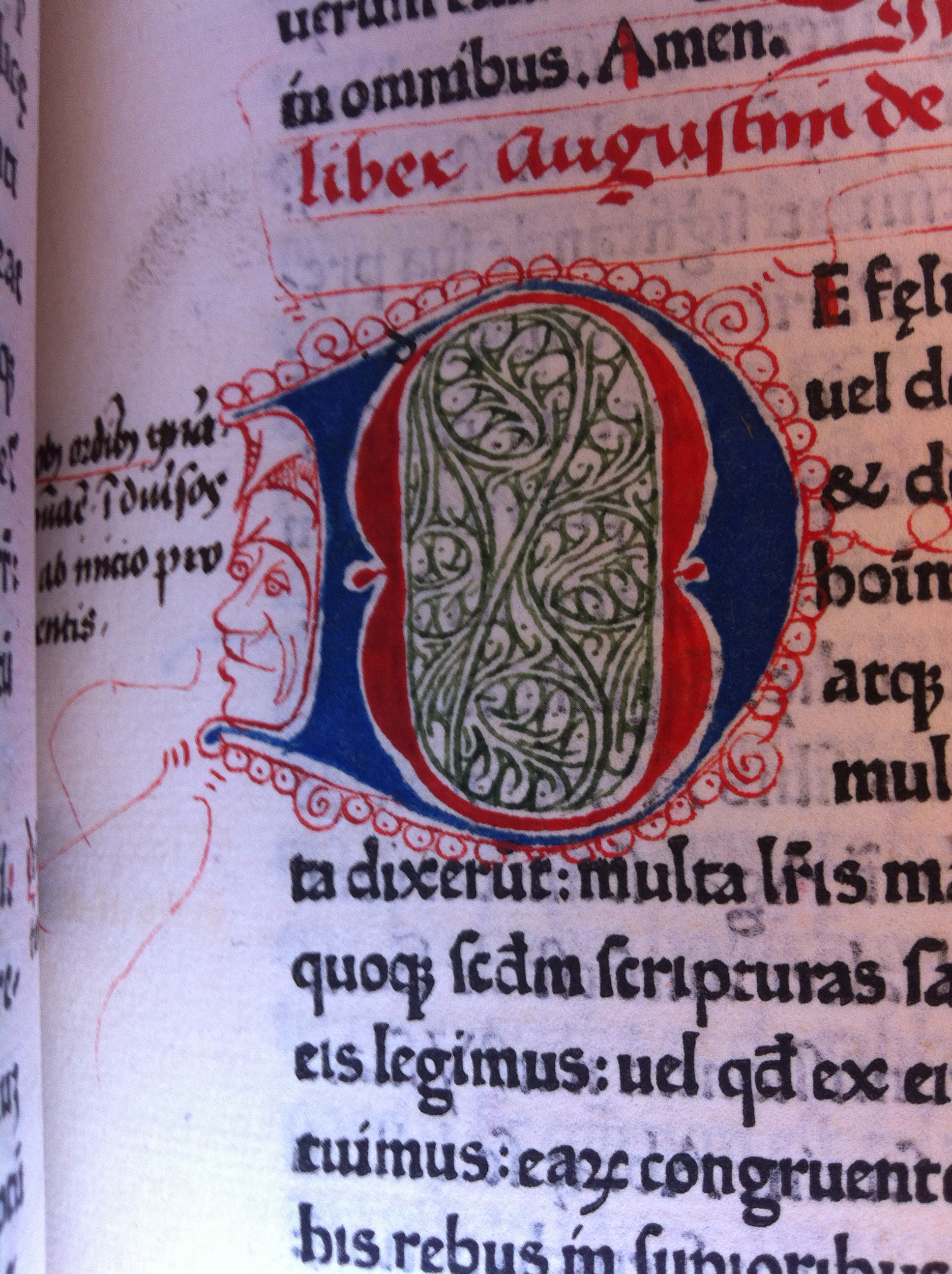
We then looked at John’s ‘current’ favorite. Augustine’s De civitate dei (City of God) printed at Benedictine abbey of Subiaco, Italy. It was operated by Arnold Pannartz and Konrad Sweinheim. 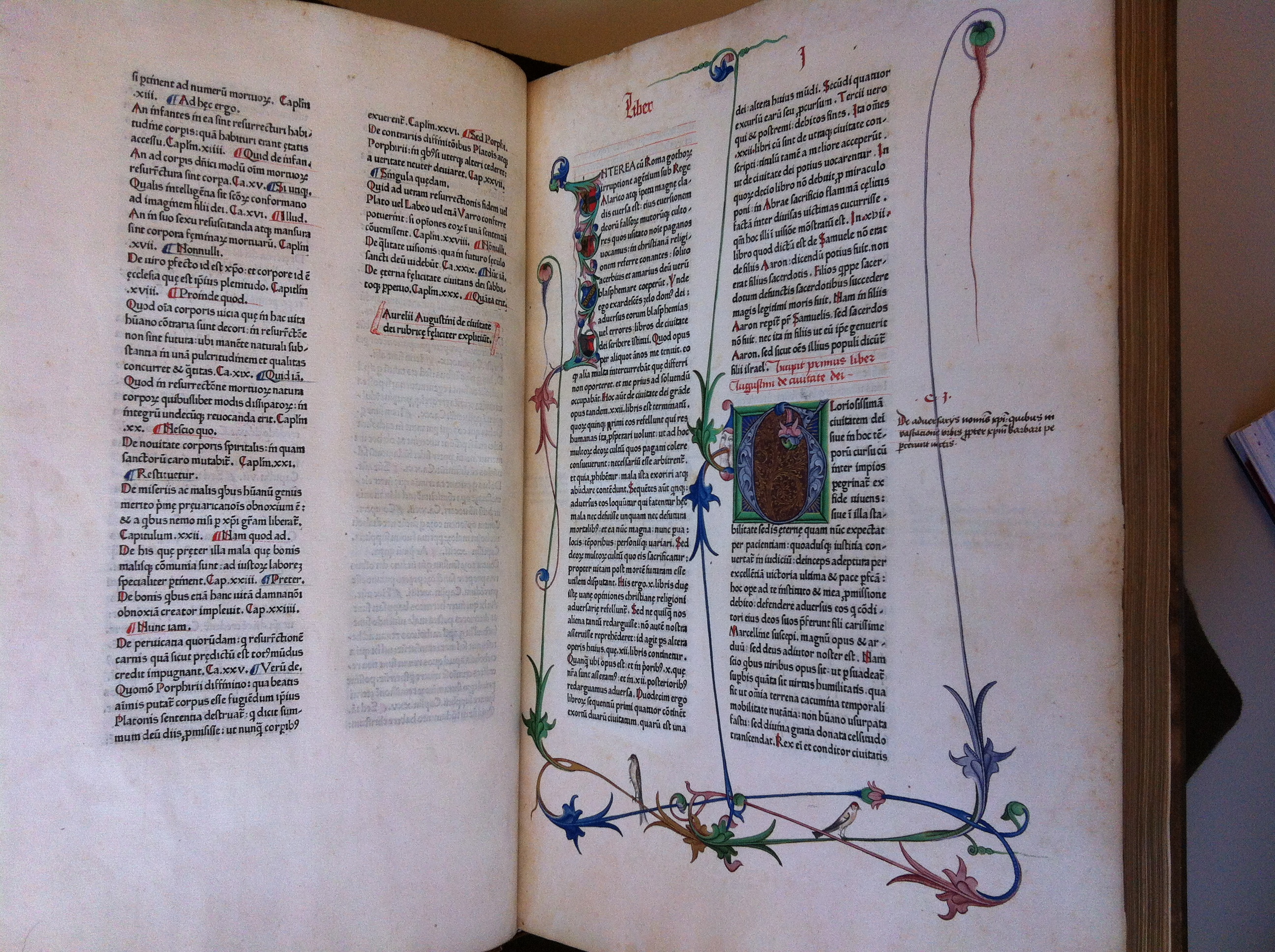
This printing illustrates a move away from blackletter and a move toward Roman style letters. Most fun, is to look at the faces drawn in by some Salzburg Austria artist. I believe adding a ‘face’ to an Initial makes it a ‘cadel’ (from the Dutch or French word “cadel,” “cadeau” for a little gift, something “extra”; it is used to refer to “extra” items, such as pen-drawn faces or grotesques, added to an initial letter). As compared to the ‘historiated initial’ I wrote about at my Bodleian delivery.
It was a wonderful visit John, Thank You.