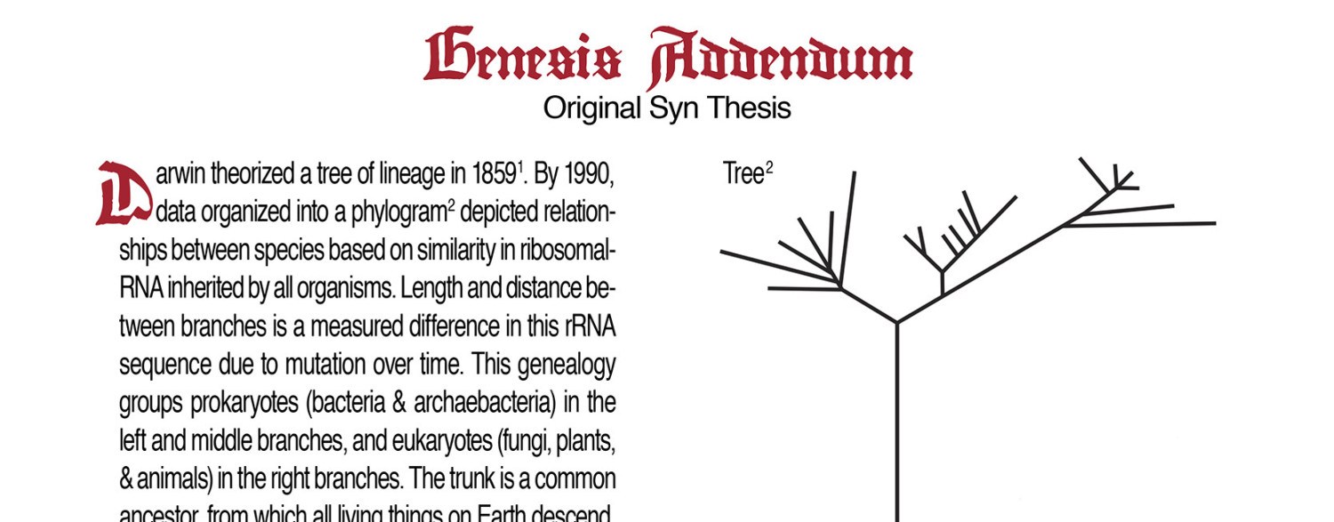
Since I used Weiss bold and regular, a serif font, they have two different surface areas which affects the clarity of the printing. Bold has MORE surface area and it was over inking. On the drum, you add packing – basically different thicknesses of paper to ‘cushion’ and raise your desired paper to best meet the face of the text. I had 6 layers of thick Timpin Paper and 2 pieces of vellum.

Delphi suggested I cut out the area in 1 sheet of the vellum where the Bold font is. It looks pretty good, even w all those serifs.

